Figuring out your streaming setup can be a lot of work, especially if you’re unfamiliar with design and creating a general aesthetic for something. Your stream overlay is part of a viewer’s first impression when they first come across your stream.
Luckily, Twitch has been around for a long time, just enough for us to find some common practices when it comes to overlays!
Learning from other successful streamers is a huge part of making your own stream grow. The layout of your graphics and content creates a distinct channel and flow for the viewer.
We’re going to look at a few examples of different overlay designs and find out what elements an overlay might highlight best.
Beautiful Graphics and Design
The nice thing about streaming is that it is a collaborative effort. From the beginning, a stream is nothing without its viewers. There is no shame in reaching out for help when it comes to designing a stream overlay.
Artists and graphic designers have seen hundreds of potential overlays, so why not have them help?
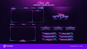
Generally, a graphic artist is going to create a nicer looking overlay than you. If you are aiming for a sleek, modern design with plenty of character for your Twitch branding, here’s an example of an overlay that you can either use yourself or draw inspiration from:
Being able to include all aspects of your stream on a standard screen capture is great for streamers with a lot of information. This overlay package comes with overlays for in-game as well!
Most importantly, a sleek design like this is malleable enough to be personalized by you. Don’t like the color scheme? The overlay itself is completely editable, meaning you can pick and choose whatever aspects you find to be the best.
Along with being customizable, finding your own graphics artist or designer to help work with you during the process is irreplaceable. There’s a big difference between just choosing something that looks nice and understanding what makes something look nice.
For example, if you’re a League of Legends streamer, there is a lot of downtime in between matches. Viewers are going to be spending time in queue with the streamer, meaning there are about 5-10 minutes of alternative stream overlay after every game.
This is the best situation for an overlay like the one above, with easily digested information displayed beautifully. Most importantly, this overlay isn’t quickly transitioned between and doesn’t feel forced onto the viewers.
Dynamic Graphics and Transitions
So, what if you want a little more than a well designed overlay? There are ways to customize your stream to match every moment with motion and dynamic overlays.
Dynamic overlays are perfect for high-energy and characterized streams. High quality transitions and personalized events on stream make for a truly ingrained streaming experience!

When it comes to the infamous DrDisrespect, one could argue that part of his success came from his dynamic stream. It’s hard to not feel hyped up and ready for gameplay when you join his intense and retro aesthetic. He has an overlay for almost every situation, in game and out of game.
Along with having multiple overlays, DrDisrespect has moving and changing overlays that do unique things based off of what happens. This sometimes goes further than his overlays, changing his voice settings and sound along with a change in scenery.
Most importantly, the effort that DrDisrespect puts into his stream’s feel is completely dictated by his overlays. One second you’re in a G Fuel locker room and the next you’re playing Call of Duty. The spontaneity and expressive design is perfect for his personality.
Fortunately, you don’t have to go as far as DrDisrespect to make a dynamic stream work!
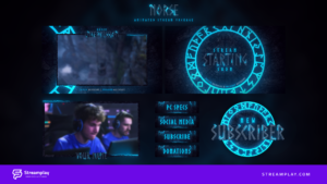
This overlay package comes with a dynamic motion intermission screen, perfect for getting into the world of changing overlays. The best part? It’s simple and effective. You don’t need to have moving buildings in your overlay to have an awesome stream.
Start off by testing the waters with one or two dynamic overlays if it’s your first time using them. It can be cluttering and confusing for viewers if you’re switching overlays non-stop, so make sure you do so with purpose and planning.
Minimalistic Graphics and Simplicity
Arguably the most common form of stream overlay is little to no overlay at all! Some call it lazy, but the minimalist overlay approach to design takes grace and consistency as well.
A minimalistic design is perfect for personality-focused and gameplay-oriented streamers.
Highlighting the stream itself is what a simple Twitch overlay does best. You can’t divert attention anywhere other than the few extra details, so how does this overlay style work for streamers?
xQc is one of the most popular streamers on Twitch as of this article’s publication. If you watch his stream, you’ll notice almost nothing in terms of overlay.

He uses some unique donation and alert overlays, but otherwise his stream is nothing but himself and whatever he’s doing.
The beauty of this style is that people clearly come to your stream and experience the streamer. If you’re a variety streamer or just someone that loves interacting with chat, leaving out the complications of overlays can be a big win.
It also opens up the opportunity to use something simple like a Twitch overlay maker if you’re on a budget and wanting something simple.
xQc is very animated and genuine with his stream which shines perfectly with a minimalist style!
The other side of a simpler overlay design is that it can heavily emphasize and highlight gameplay. Looking at a streamer like dizzy or Gosu’s history is filled with overlay-less highlight reels of insane plays.
If you’re really good at what you stream, you might be hindering yourself by incorporating a heavy-handed overlay package.
As mentioned earlier, the nice part about a simpler approach is that you probably won’t need to invest much time or money into designing an overlay.
As long as the basics of donations and subscribers, and maybe even a Twitch chat overlay are shown, you really don’t need much else.
The minimalistic approach is also great for absorbing aspects of graphic design and dynamic overlays. With a blank slate, anything you like can easily fit without feeling too clustered or out of place.
Check out our other guide on Twitch panel ideas here.
Final Thoughts
So there you have it, three distinct styles and ideas that you can use as influence for your own stream overlay. Keep in mind that there is never a right or wrong when it comes to how you want to express yourself, including your stream overlay.
However, it never hurts to get a second opinion on a color palette or shimmering effect to an intermission overlay. As long as you don’t go through your overlay design blind, you’re on the right track.
The best place to start for any streamer, new or more seasoned, is to figure out your goals and purpose for streaming. Your overlay, along with the rest of your stream’s presentation, is an extension of that purpose.
Want a stream that looks professional, pleasing potential sponsors and viewers? A personally designed overlay is perfect.
Focused on the gameplay? Stick to minimalistic design. A good idea is to outline different styles of overlays and figure out which you like best.
There also aren’t any rules against using aspects of these styles together. If there’s something you like about theme or color scheme, incorporate it into your Twitch bio or wherever you see fit!


